Context
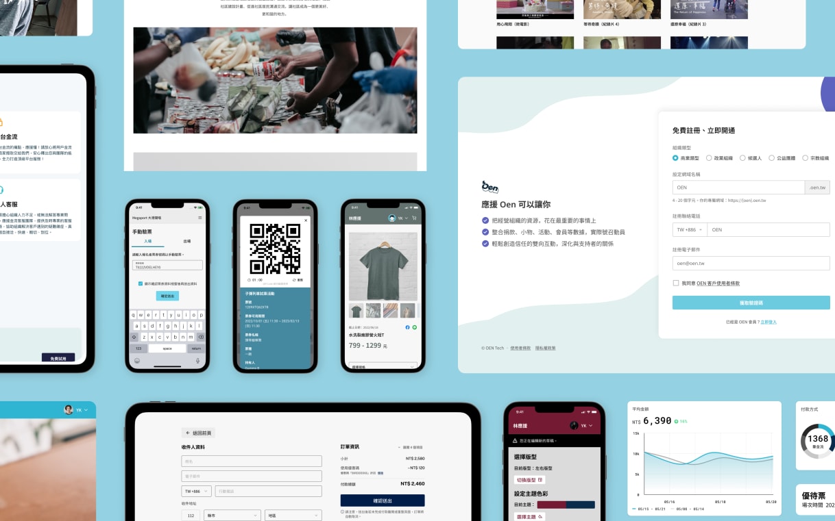
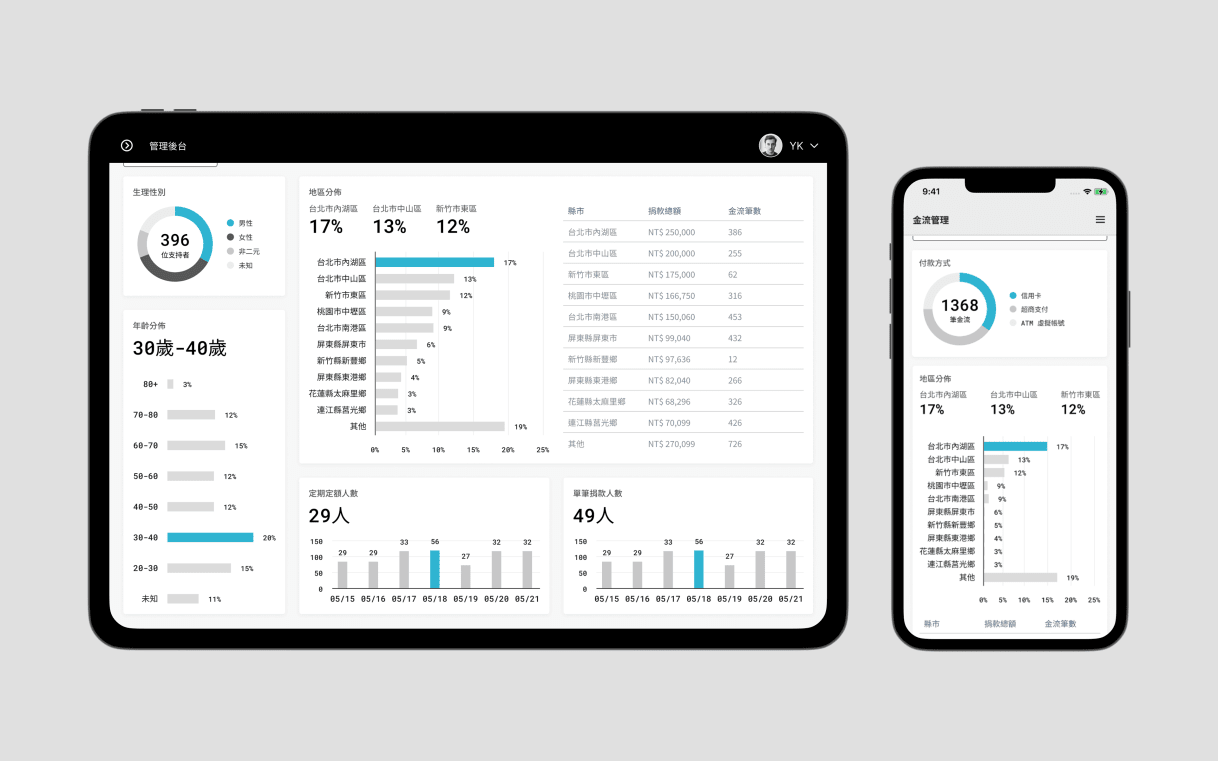
Oen is a B2B fintech platform for payments, donations, events, memberships, and CRM. Its 1,000+ client organizations need branded customer experiences without separate product codebases for every client.
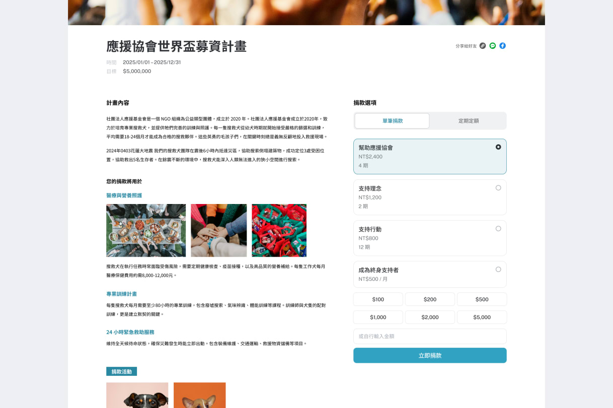
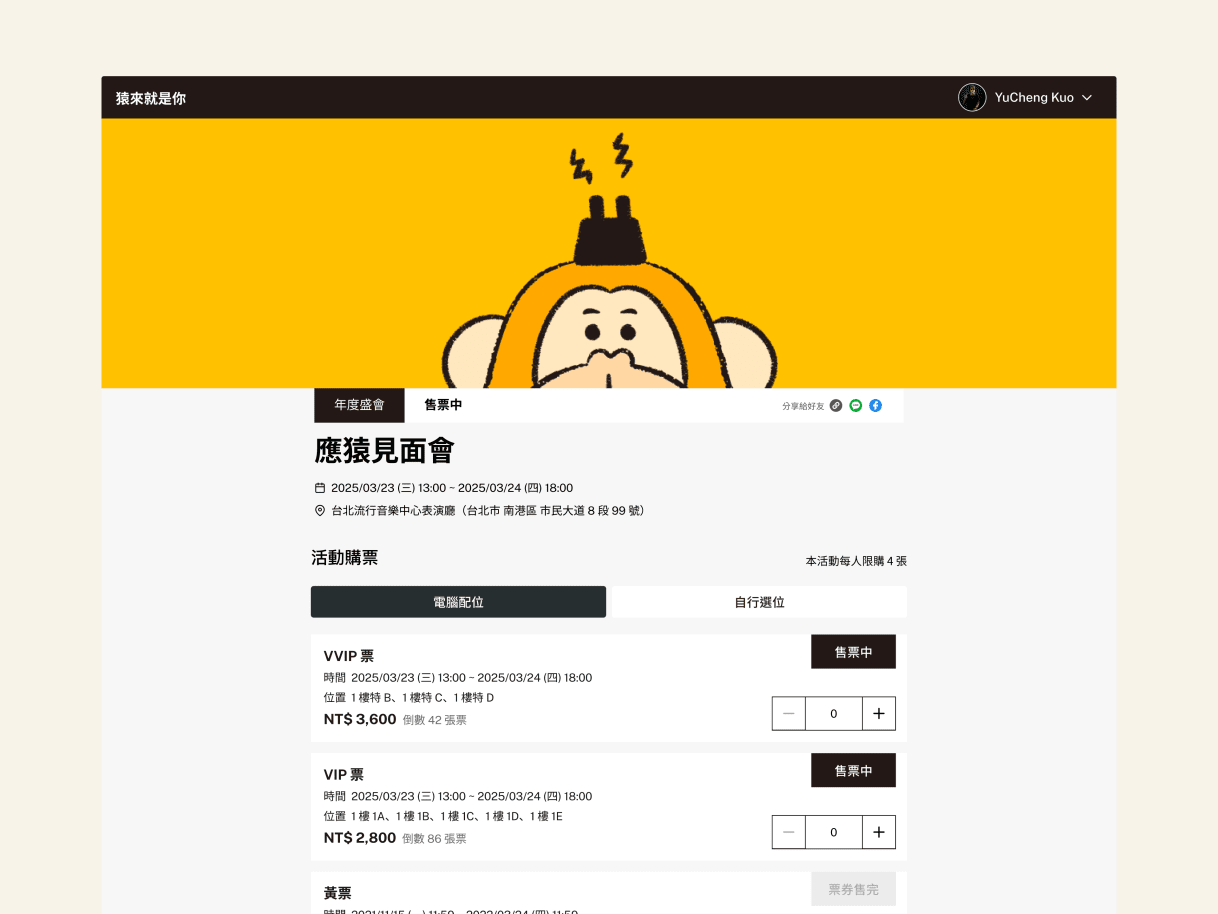
Started in 2021 as Oen's first in-house design foundation, the 2025–26 rebuild made token names and component APIs the shared contract between design and engineering. A client theme changes named tokens; core workflows and behavior stay shared.
My role
I started the system in 2021 and have owned its design direction through three major revisions:
- 2021 → Established a guideline and component library from existing product patterns
- 2023 → Refined color and component patterns that had begun to drift
- 2025–2026 → Rebuilt the foundations: tokens, component coverage, and visual range
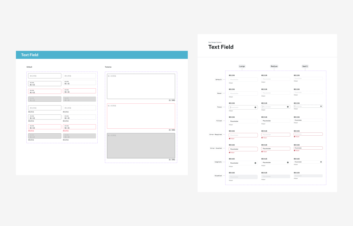
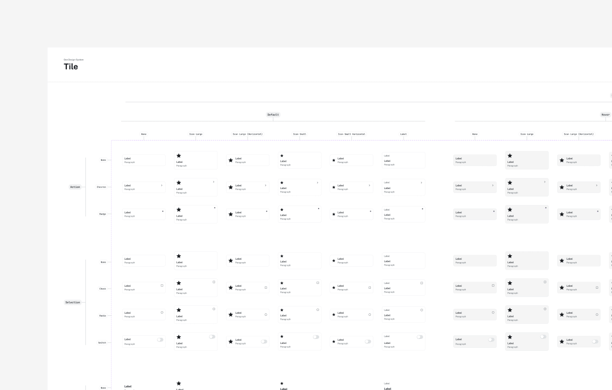
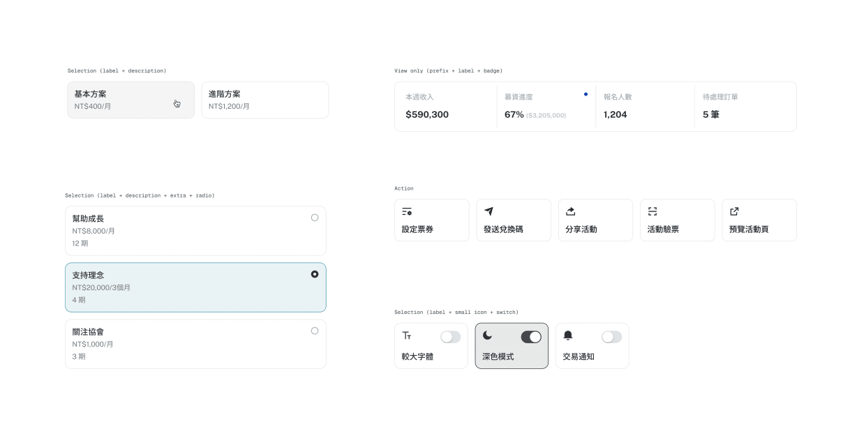
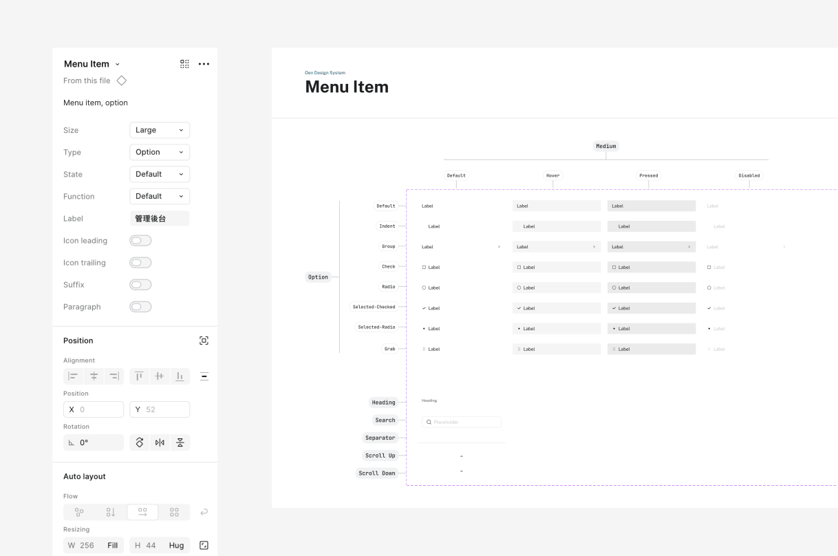
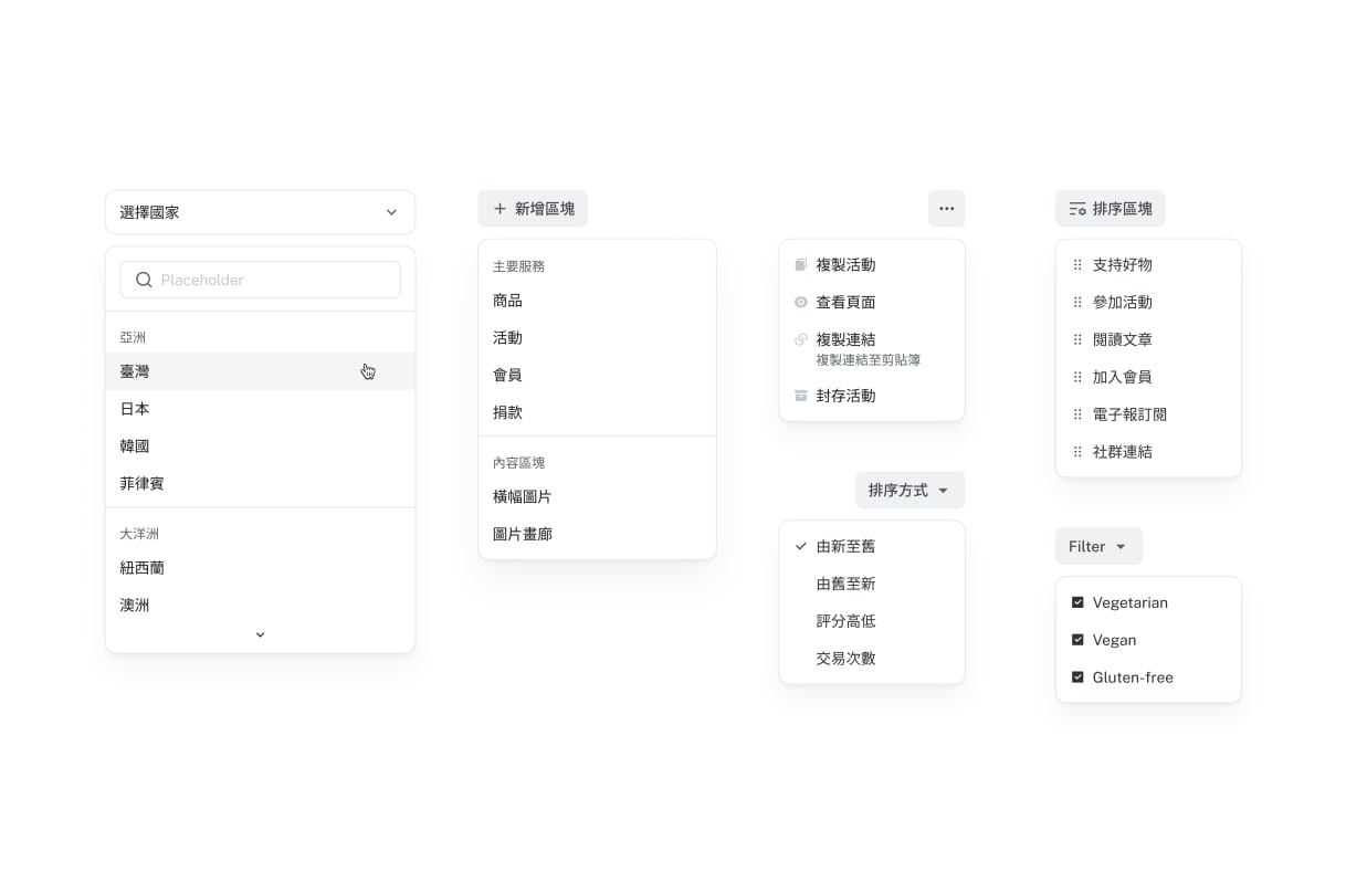
For the latest revision, I set the token, component-boundary, responsive-state, and composition decisions. I designed and specified the Figma library, token model, component properties, usage rules, and responsive behavior. Frontend engineers partnered on feasibility, product code, and Storybook documentation.
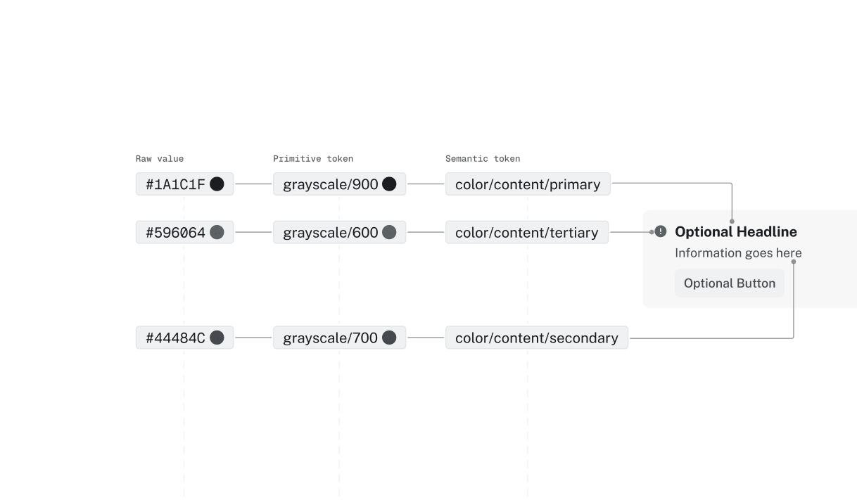
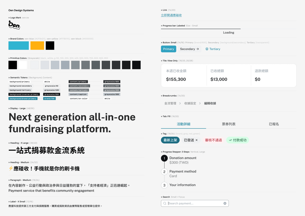
It introduced token layers: primitive tokens supply values; semantic tokens name what they are for. Questions like "gray/100 or gray/200 for a border?" no longer come up. A semantic name carries that decision into design specifications and implementation.
Changing a feedback color or surface is one shared decision, not an audit across every component. Design and code can use structures suited to their own work while relying on the same named decisions.
Results
- 0%→64% adoption in 5 months (estimated from file-level counts)
- 36% of legacy button and form field usage replaced
- 2,000+ documented Figma library items (variants, states, and reusable patterns)
- 200+ semantic tokens for Oen's core brand and client-theme assignments
- Average 500+ insertions per week over one year across teams in Figma
Credit
- Design: YuCheng Kuo, Sandy Man, Julia Chan
- Engineering: Kelly Pan, Charlie Chang, Jaster Chang, Rong Lin, Lobster Yu