Context
Oen offers merchants a CRM-integrated platform to sell on. It was architected as a marketplace — one hub where shoppers browsed products across many merchants at once.
That shape came from Oen's origin as a donation platform for nonprofits and political organizations, where donors browsed the perks offered by the causes they supported. As the platform expanded to serve merchants of every kind, behavior drifted away from the architecture: people arrived on a specific merchant's site already intending to buy, not to browse across merchants.
My role
I designed the end-to-end purchase experience — product detail, cart, checkout, order confirmation, responsive behavior, and the adaptive presentation that lets one flow carry many merchant brands. I worked with product and engineering on where the flow could change without forking the commerce infrastructure every merchant shares.
Flow modification
Merchant site
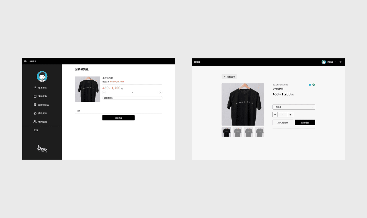
↓Product preview [Remove step with minimal info]
↓ (cross domain) [merchant → user]
Product detail
↓
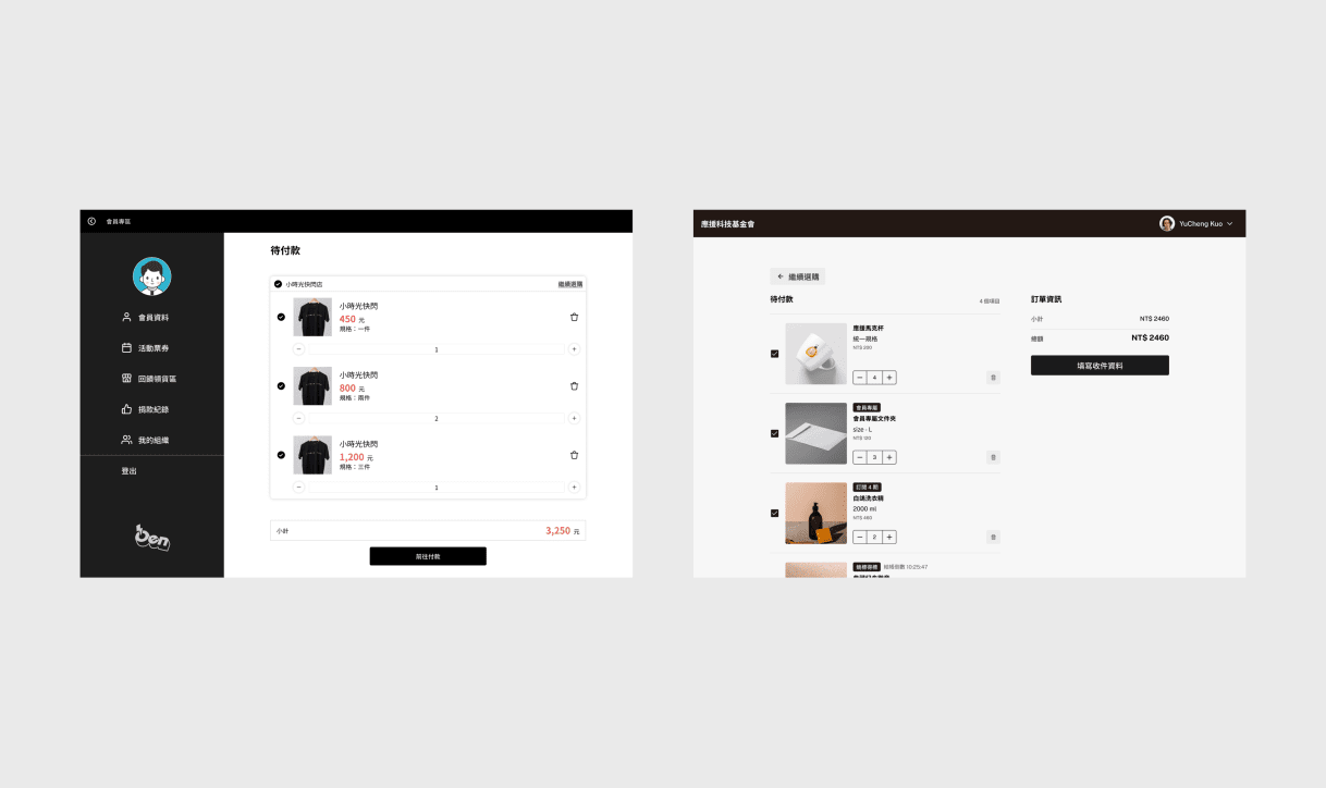
Cart
↓ (cross domain) [user → merchant]
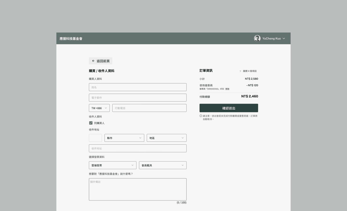
Checkout
↓
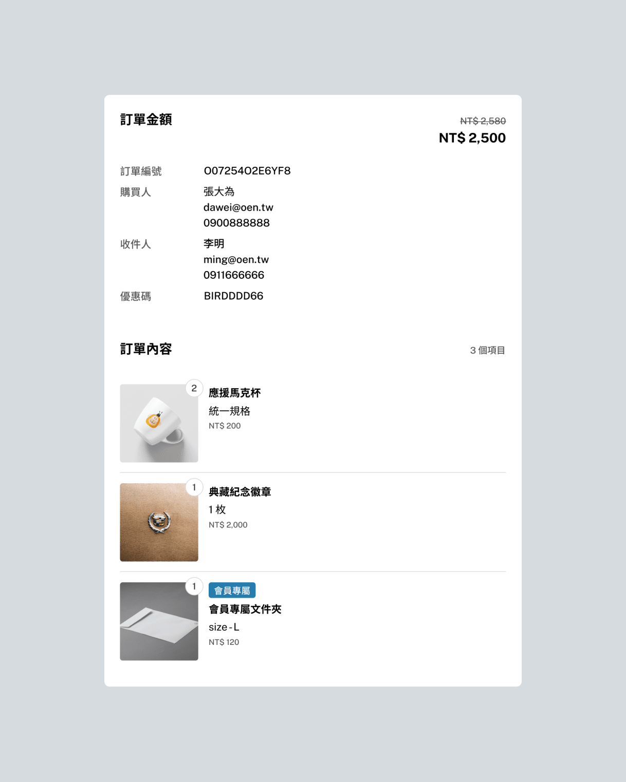
Complete
Completing a purchase meant leaving the merchant's site, passing through a product-preview page that carried almost no information, then returning to the merchant domain to check out. Two domain changes and two visual contexts, for a task the shopper had already committed to.
The same handoff was also breaking the data. Crossing domains broke the link between a merchant's site and the completed order, so merchants could see traffic arrive and revenue land without seeing anything in between. Drop-off was invisible, which made pricing and promotion decisions guesswork.
Redesigned flow
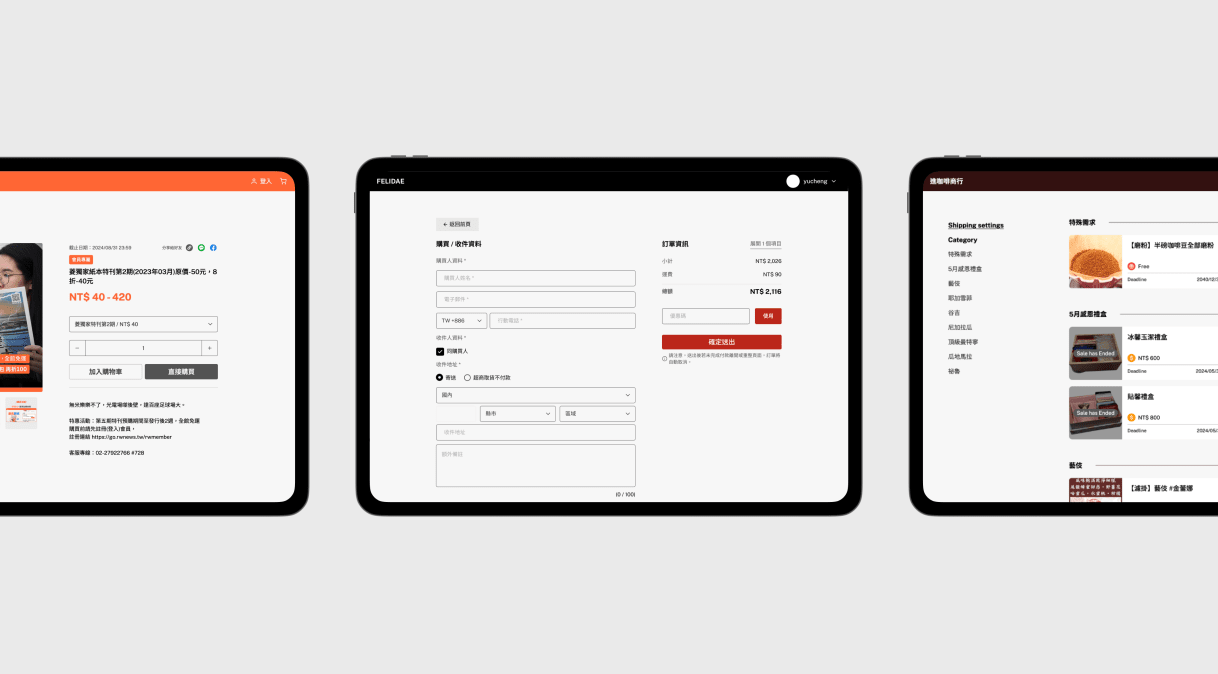
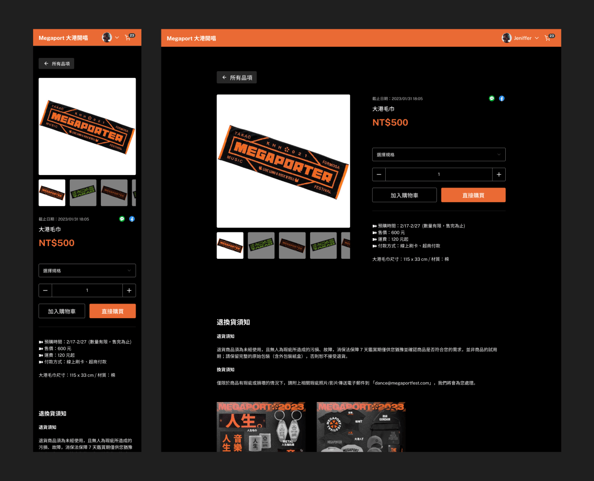
Product detail became a destination rather than a pass-through. The two-column layout (images left, details right) gives shoppers enough to decide with, replacing a preview page whose only real function was to redirect.
Checkout became embedded rather than redirected, eliminating the domain switch entirely. The purchase stays inside the merchant's branded context while Oen's payment infrastructure continues to run underneath it.
The cheaper option was to keep the handoff and theme Oen's hosted checkout per merchant, so the redirect at least landed on something that looked like the store. It was not taken because the data break comes from the domain change, not from how the page looks.
Impact
15% less time to complete a purchase, measured across 2,000+ orders a month, and a funnel that runs from the merchant's site to the completed order again. Both come from removing one step: the handoff that made shoppers cross domains twice was the same handoff that hid their behavior from the merchant. Neither side was tuned on its own.
Related features after launch
- Membership-only product
- Coupon code
- Shipping method and fees (for physical products)
- Subscription product
- Bidding product
- Digital product (downloadable content after purchase)
- Purchase limitation (total amount, per cart amount)
Credit
- Design: YuCheng Kuo
- Product: Hsiyuan Chou, Nyo Fang
- Engineering: Jaster Chang, Charlie Chang, Trista Wei, Calvin Chang