Context#
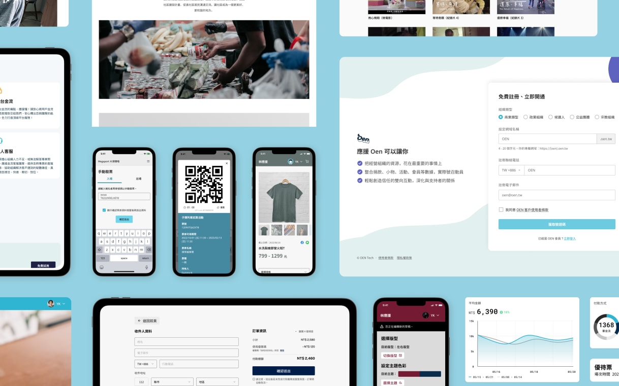
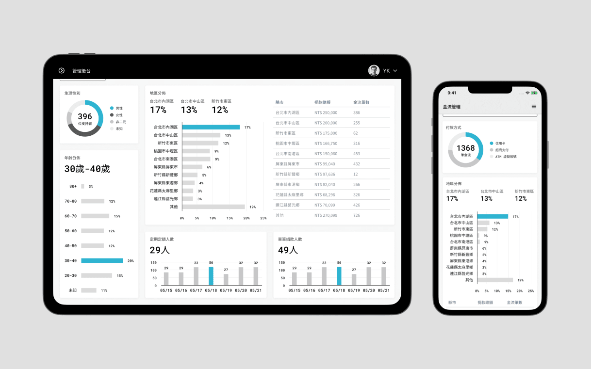
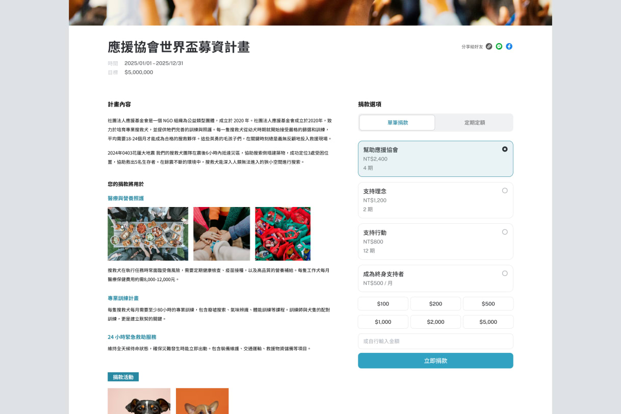
Oen is a B2B fintech offering CRM platforms for diverse clients across multiple product lines. They work with clients from buniness to nonprofits like Megaport Fest. 大港開唱, Taiwan NPO Self-Regulation Alliance 自律聯盟, Open House Taipei 打開台北 and Plain Law Movement 法律白話文.
As Oen's first designer, I initiated the design system from 0→1 and evolved it alongside the engineering team to serve 500+ clients across multiple product lines. My background in design and frontend development enabled close collaboration on component architecture and implementation.
Evolution#
2021 - Initial establishment of design guideline/library to create consistency baseline
2023 - Strategic refinements of colors and components to address inconsistent patterns
2025 - Major expansion on component coverage and visual styles to support product growth
The main challenges for Oen are diverse client categories and multiple product lines. Clients range from nonprofits who value transparency and improvements on their exisiting workflow, to business with specific niche in each sector, and political organizations that emphasize complicance and supporter relationships.
The challenge: The systems need flexibility to support each client type's needs (branding or functional), while also stay maintainable for a startup team.

Latest updates#
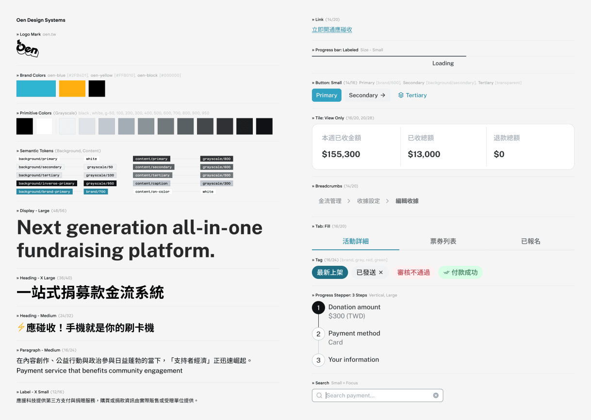
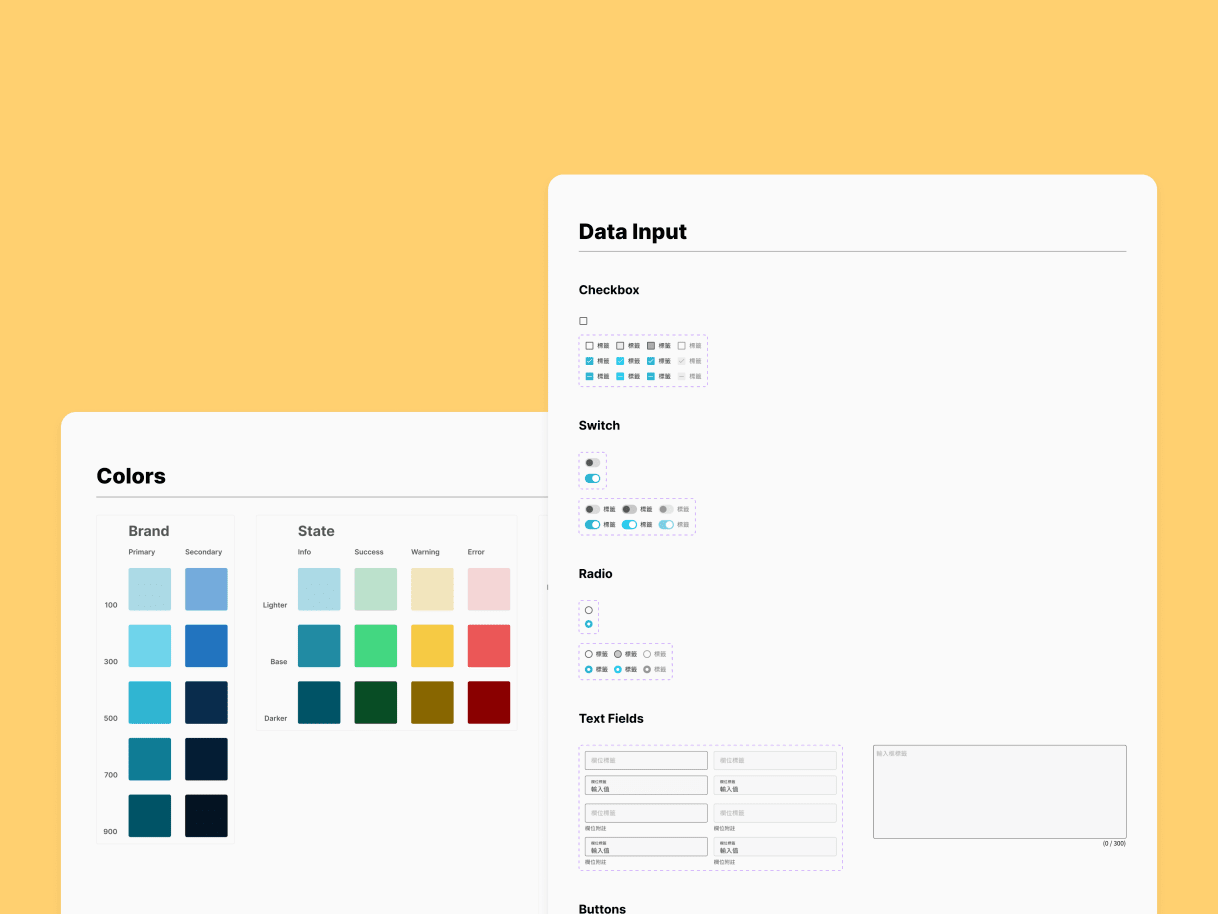
The latest updates rebuilt the system from foundations up, structuring components by function and usage patterns. We introduced design tokens with clear semantic structure, reflecting how the engineering team uses CSS tools like TailwindCSS. This established a common language between design and development.
A key insight driving the token architecture was propagation: a single semantic token change cascades through every component referencing it, meaning a decision made once applies consistently across 400+ components and all client contexts. This made the question of what belongs in the token layer versus what lives in the component layer load-bearing. Push decisions too high and the system becomes rigid; too low and drift accumulates across components over time. Much of the v2 rebuild was about correcting where those boundaries had been drawn in v1.
The system now includes 400+ components across 8 categories, with ongoing collaboration on React implementation and documentation.
Key decisions#
- Semantic tokens for theming flexibility
- Variant-driven architecture for scalability
- Flexible composition for different use case
- Composition patterns for complex UIs
- Implementation feasibility from design phase
Impacts#
- 0→1 scale: enable growth to 500+ clients
- Efficiency: Reduced design-to-dev friction through shared component language
- 400+ components across 8 categories, actively maintained and evolved
![A [Tile] component usage showcase in function: action, selection and view.](https://res.cloudinary.com/yucheng/image/upload/w_1218,q_auto,f_auto,dpr_auto/work/klfmtwkzz3w3s13cudyp)
![A [Menu] component showcasing its composability](https://res.cloudinary.com/yucheng/image/upload/w_1218,q_auto,f_auto,dpr_auto/work/jwenroethoczevaedrve)

Mentions#
- Megaport Festival 大港開唱
- Taiwan NPO Self-Regulation Alliance 自律聯盟
- Open House Taipei 打開台北
- Plain Law Movement 法律白話文
Team#
YuCheng Kuo, Sandy Man, Julia Chan (Design)
Charlie Chang, Jaster Chang, Kelly Pan, Rong Lin (Engineering)