Context
NCCU (National Chengchi University) wanted a donation site that read as the university's own, on a platform shared with 500+ other organizations. Every decision had to answer twice over: once to NCCU's donors, and once to everyone else already on the platform.
Oen had the pieces an educational institution needs to collect donations: receipt issuing, donor management, product setup. What was missing for NCCU was the donor side. The existing site put one generic form in front of alumni, faculty and corporate partners alike, with nothing on it to say what a gift was funding.
My role
I was the sole designer on the project. I audited NCCU's existing site and brand guidelines to find where the donor experience was losing people, designed the donation flow and the supporting pages, and worked with product and engineering on which needs belonged in the core platform and which stayed specific to NCCU.
Platform extension
NCCU asked for features the platform did not have, including a custom email sent after a donation, and additional fields on the donor form. We evaluated whether to keep them NCCU-specific or generalize them into platform-wide features. Each customization needs documenting, and every designer, engineer and account manager afterwards has to know which behavior is core and which is NCCU's before either is safe to change.
Both went into the core platform: a post-donation email and a configurable donor form can hold for a nonprofit and a political campaign as well as a university. Feature categorization and generalization into the core moved the platform closer to how clients expect it to work.
Donation flow
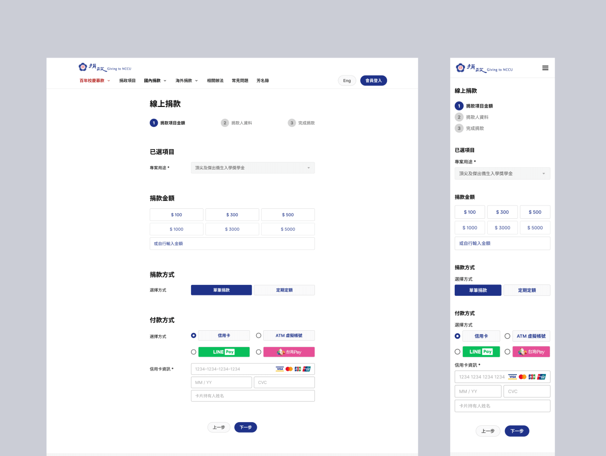
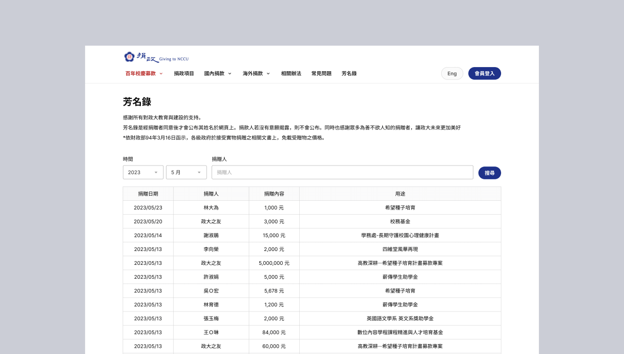
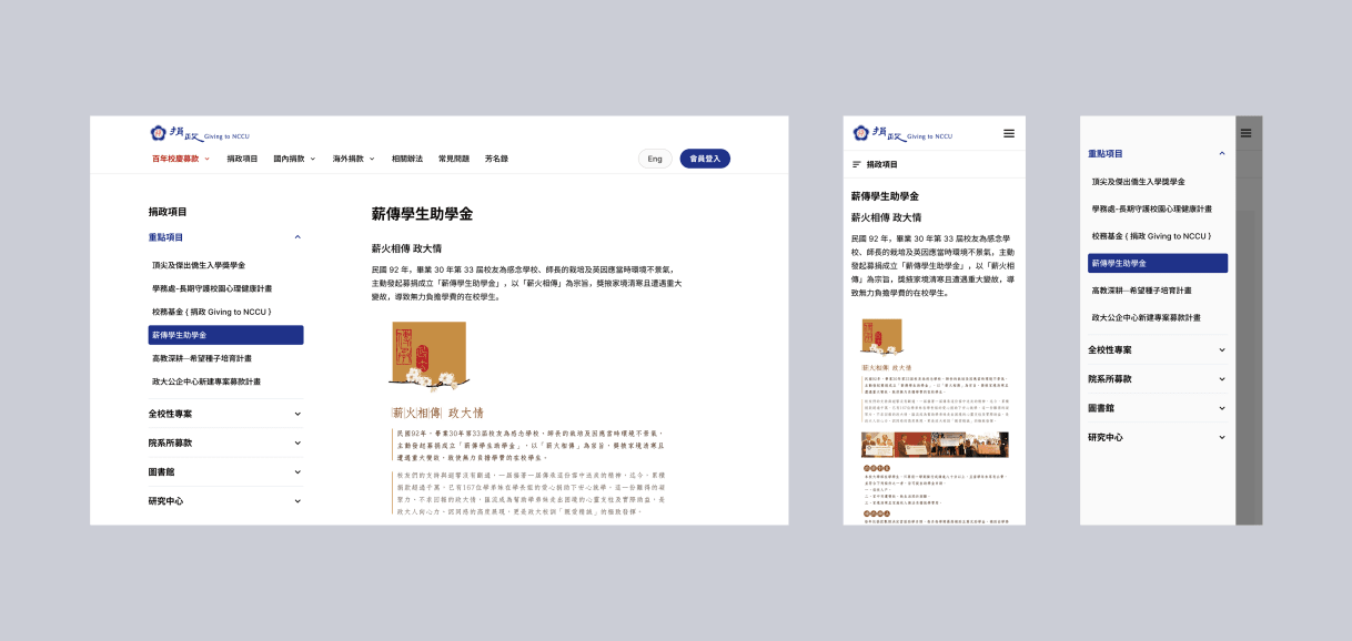
Rather than one generic form, the flow is built around projects, so a donor sees what they are funding and how far along it is before committing. Giving itself became three steps with visible progress, replacing an experience that never said how much was left.
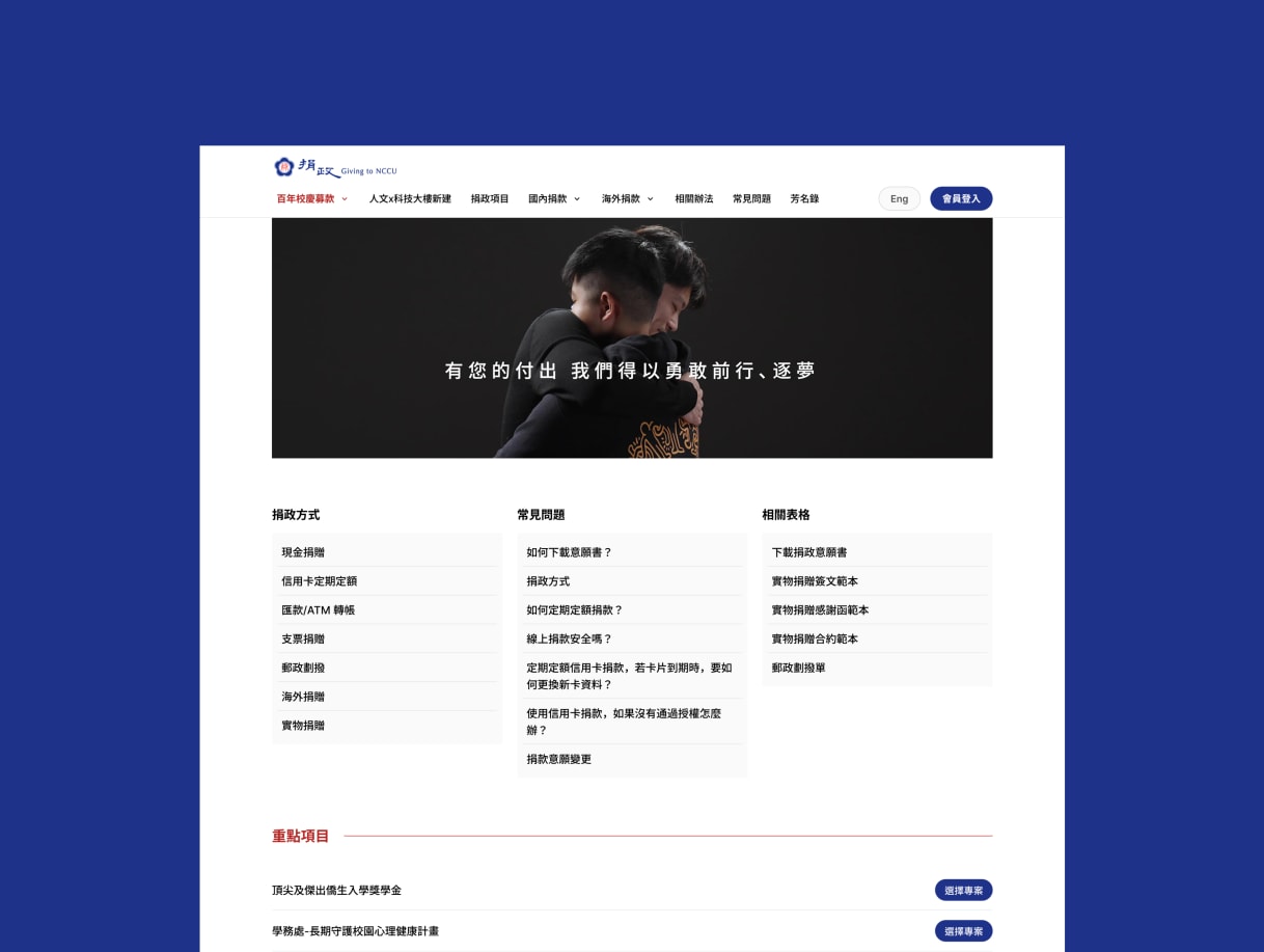
Navigation stayed close to NCCU's existing site. Donors arriving from university channels already knew where things were, and a redesign that relocated everything would have cost more trust than the cleaner layout earned.
Impact
- NT$1M+ moves through the site each month today, across 200+ donation projects run by the departments
- 5+ educational institutions have since come to Oen on the same footing
Credit
- Design: YuCheng Kuo
- Product: Hsiyuan Chou, Nyo Fang, Elsa Yeh
- Engineering: Jaster Chang, Rong Lin, Andy Tsai, Calvin Chang, Rex Chen, Kelly Pan
- QA: Zion Yu